It seems like every UI design we are asked to implement these days has what I call “designer scroll bars” – skinny little tone on tone scroll bars that have no scroll arrows. While I’m not a big fan of these scroll bars for a number of reasons (not least of which is usability), they are still something we’re required to do on a fairly common basis.
Luckily, in Flex 3 hiding the scroll arrows, and making the scrollbar thinner is a fairly simple task that you can accomplish globally with just a few lines of CSS.
ScrollBar { up-arrow-skin: ClassReference(null); down-arrow-skin: ClassReference(null); trackSkin: Embed(source="skins/ScrollBarTrack.png", scaleGridLeft="1", scaleGridTop="4", scaleGridRight="5", scaleGridBottom="16"); thumbUpSkin: Embed(source="skins/ScrollBarThumb_up.png", scaleGridLeft="1", scaleGridTop="4", scaleGridRight="5", scaleGridBottom="16"); thumbOverSkin: Embed(source="skins/ScrollBarThumb_over.png", scaleGridLeft="1", scaleGridTop="4", scaleGridRight="5", scaleGridBottom="16"); thumbDownSkin: Embed(source="skins/ScrollBarThumb_down.png", scaleGridLeft="1", scaleGridTop="4", scaleGridRight="5", scaleGridBottom="16"); } |
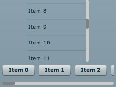
Using a null class reference as the skins for the arrow buttons effectively hides the arrows. In the above example I am using 6x20px PNGs for the thumb and track skins, and setting scaleGrid properties to preserve the rounded corners. The scroll bar will lay itself out based on the dimensions of the PNG graphics, making it 6px wide. You can see the result below.
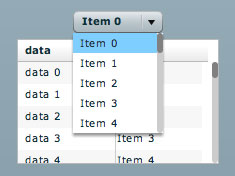
The only issue I’ve discovered so far is that some lists (ex. DataGrid) will not redraw correctly according to the scrollbar width until the first time the user interacts with them. I’ll try to post the solution to this in the next few days. You can see this issue in the picture below, where the cell renderers and headers are not sized appropriately.
looks slick, just don’t make them too small or the usability of your Flex app goes out the window! Fitz Law describes this quite nicely.
Passing in null for the ClassReference works too (for hiding the arrows).
John,
You’re right. That’s even simpler. I will update the article to reflect that.
Simply perfect! I used it right away in a chart annotation in order to be able to scroll the chart contents. Thx a lot!
Is there any way you could show the example application for this? and have the view source available?
very cool.
Nice and useful article!
I’ve just wrote a little addition to this post on my blog, about Designer ScrollBars and especially how to implement scroll thumb with a fixed size. View Source included!
Check it out on:
http://npacemo.com/wordpress/2008/05/20/flex-3-designer-scrollbar-fixed-size-scrollthumb/
Okay as long as they allow for scrollwheel actions, otherwise I hate them as they define an annoyingly different user experience from the rest of the world.
Hi…. nice tips..How to change the color of the Scrollbar(I have changed its skin) when I select a color from Standard ColorPicker
Note:
I know this will work if we didn’t skin the Scrollbar
private function init():void {
vs.setScrollProperties(300,0,310,300);
vs.lineScrollSize = 300;
}
private function changed(event:ColorPickerEvent):void {
for(var i:int=0; i
But how to change its color If I skin the scrollbar.
Perfect,I think your’s example that I needed.do you send it to me ,thanks
my email: flysnail2008@hotmail.com
Thanks for posting this. It helped me a lot.
i tried it but couldn’t hide the up/down arrows.
ScrollBar{
up-arrow-skin: ClassReference(null);
down-arrow-skin: ClassReference(null);
}
i am using flex. 3.0.1 what sdk are you using?
Do you ever get to the bottom of the problem with the width not redrawing correctly? Could really do with that fix right now 😉
I know it’s dirty but you can replace the up and down arrow skins with a transparent 1x1px gif. It works 100% of the time.
Would be better to use a null reference if you could make it work properly though.
Thanh you so much. Example is very useful to me.
Blesses.
the scroll bar style is applied on all or none. how can i apply style on menu selectively. i tried styleName but it does not works
@dev:
Try setting the verticalScrollBarStyleName on your menu.
myMenu.setStyle(“verticalScrollBarStyleName”, “myScrollBar”);
And put the appropriate declaration in your CSS.
.myScrollBar {
up-arrow-skin: …;
etc…
}
any fix for the gap on the left of the scrollbar?
Any idea how to make the thumb Not to scale as the content grows?
Thank you Randy for this very useful, time-saving tip and good industry blog!
Well I get this error using your exact code:
trascoding parameter ‘scaleGridTop’ is not supported by ‘flex2.compiler.media.SkinTrascoder’
I’m using Flash Builder 4.1 and Flex SDK 3.5
😐
is this valid for scroller in Flex 4?
I apply this skin for HTML mx control that is working fine
here my css code for that
.htmlVScroll
{
up-arrow-skin: ClassReference(null);
down-arrow-skin: ClassReference(null);
trackSkin: Embed(source=”skins/trackV.png” , scaleGridLeft=”1″, scaleGridTop=”4″, scaleGridRight=”5″, scaleGridBottom=”16″);
thumbSkin: Embed(source=”skins/thumbV.png” , scaleGridLeft=”1″, scaleGridTop=”4″, scaleGridRight=”5″, scaleGridBottom=”16″);
}
But if i apply this code with little changes of style name for horizontal scroll. it did’t work
any solution ?
Could you please provide the png images referenced in the code you have pasted above?
Thanks..
Is important that if you get the error
CSS type selectors are not supported in components: ‘ColumnChart’
You need to change the “ScrollBar” global selector to a Class selector “.scrollBarStyle”
.scrollBarStyle
{
up-arrow-skin: ClassReference(null);
down-arrow-skin: ClassReference(null);
trackSkin: Embed(source=”assets/ScrollBarTrack.png”, scaleGridLeft=”1″, scaleGridTop=”4″, scaleGridRight=”5″, scaleGridBottom=”16″);
thumbUpSkin: Embed(source=”assets/ScrollBarThumb_up.png”, scaleGridLeft=”1″, scaleGridTop=”4″, scaleGridRight=”5″, scaleGridBottom=”16″);
thumbOverSkin: Embed(source=”assets/ScrollBarThumb_over.png”, scaleGridLeft=”1″, scaleGridTop=”4″, scaleGridRight=”5″, scaleGridBottom=”16″);
thumbDownSkin: Embed(source=”assets/ScrollBarThumb_down.png”, scaleGridLeft=”1″, scaleGridTop=”4″, scaleGridRight=”5″, scaleGridBottom=”16″);
}